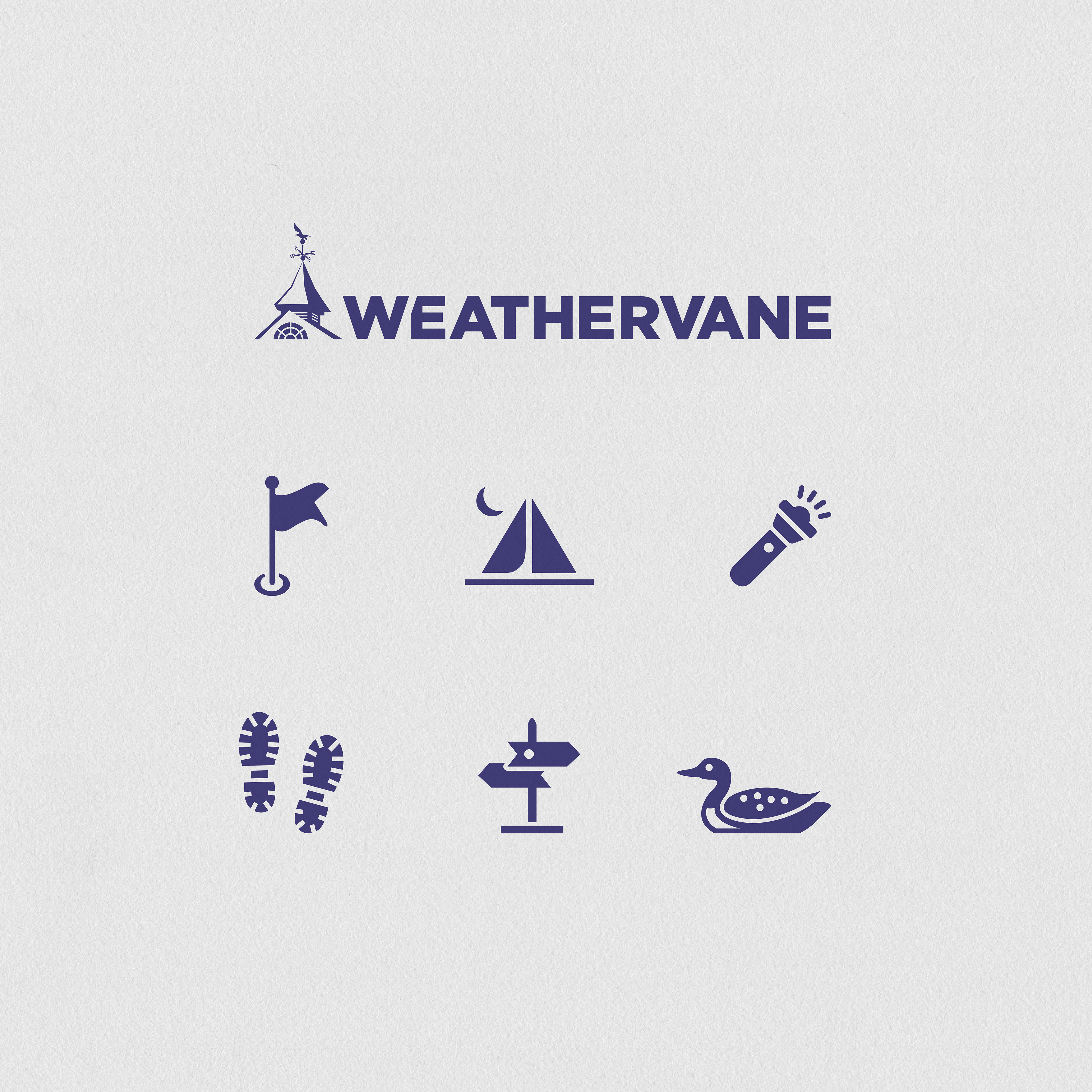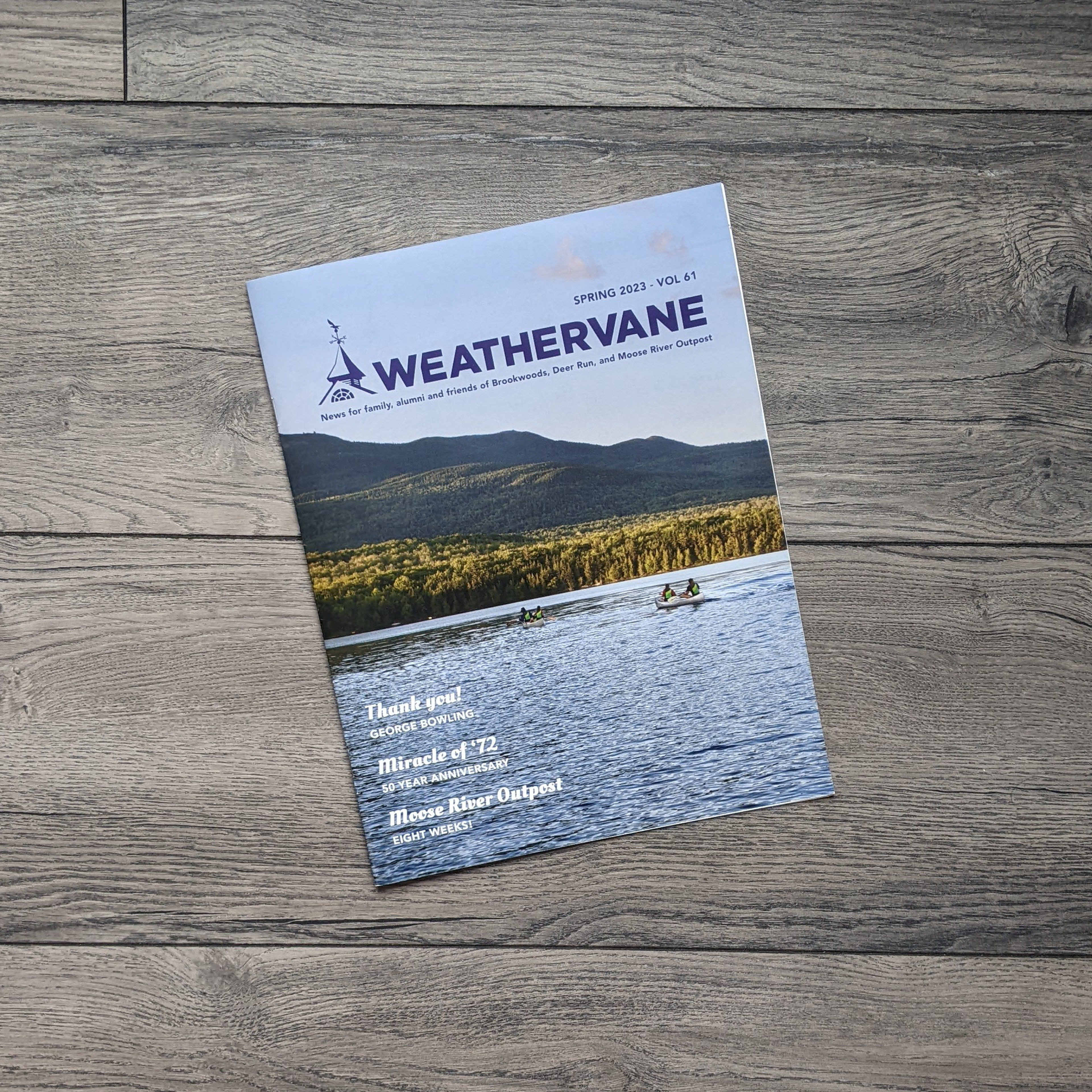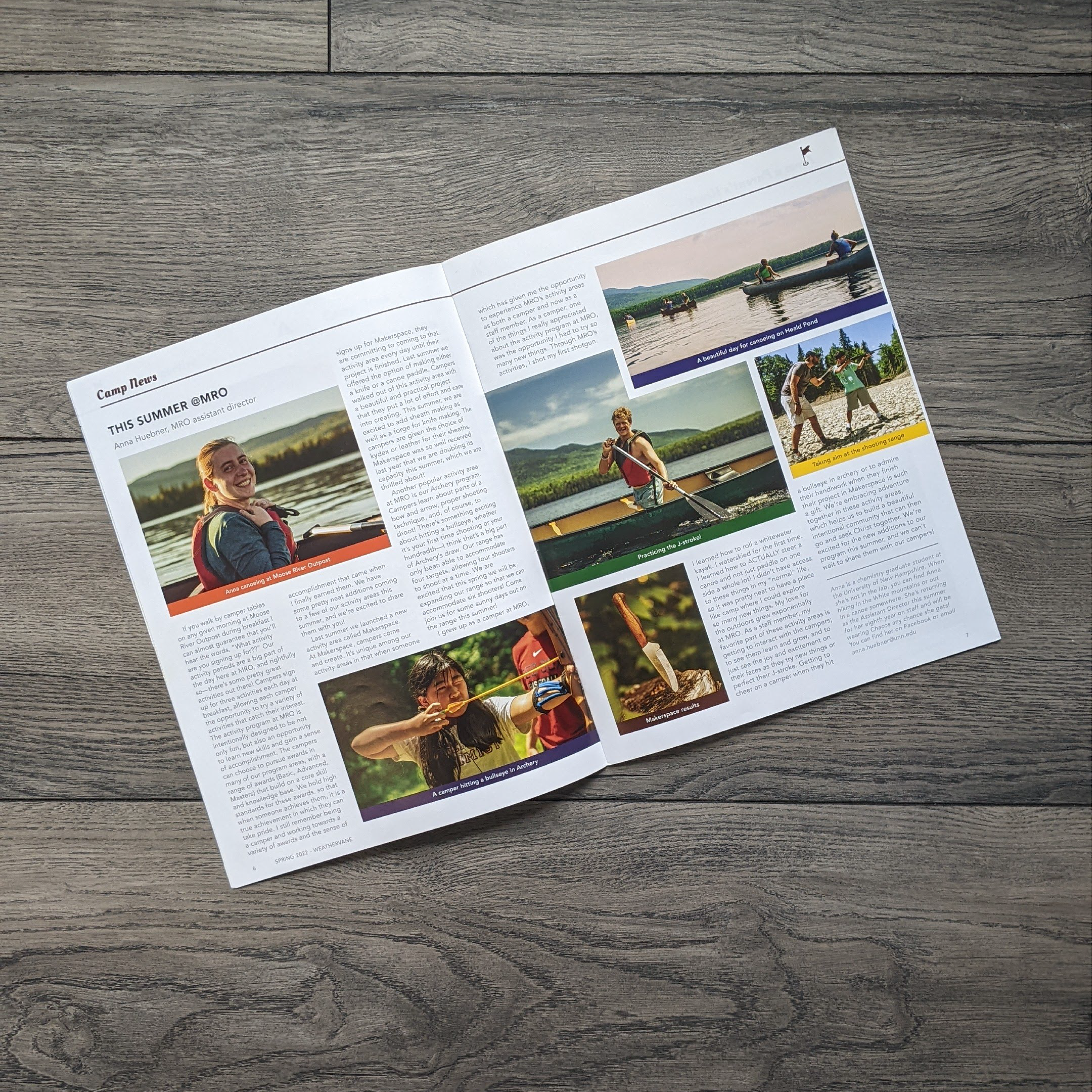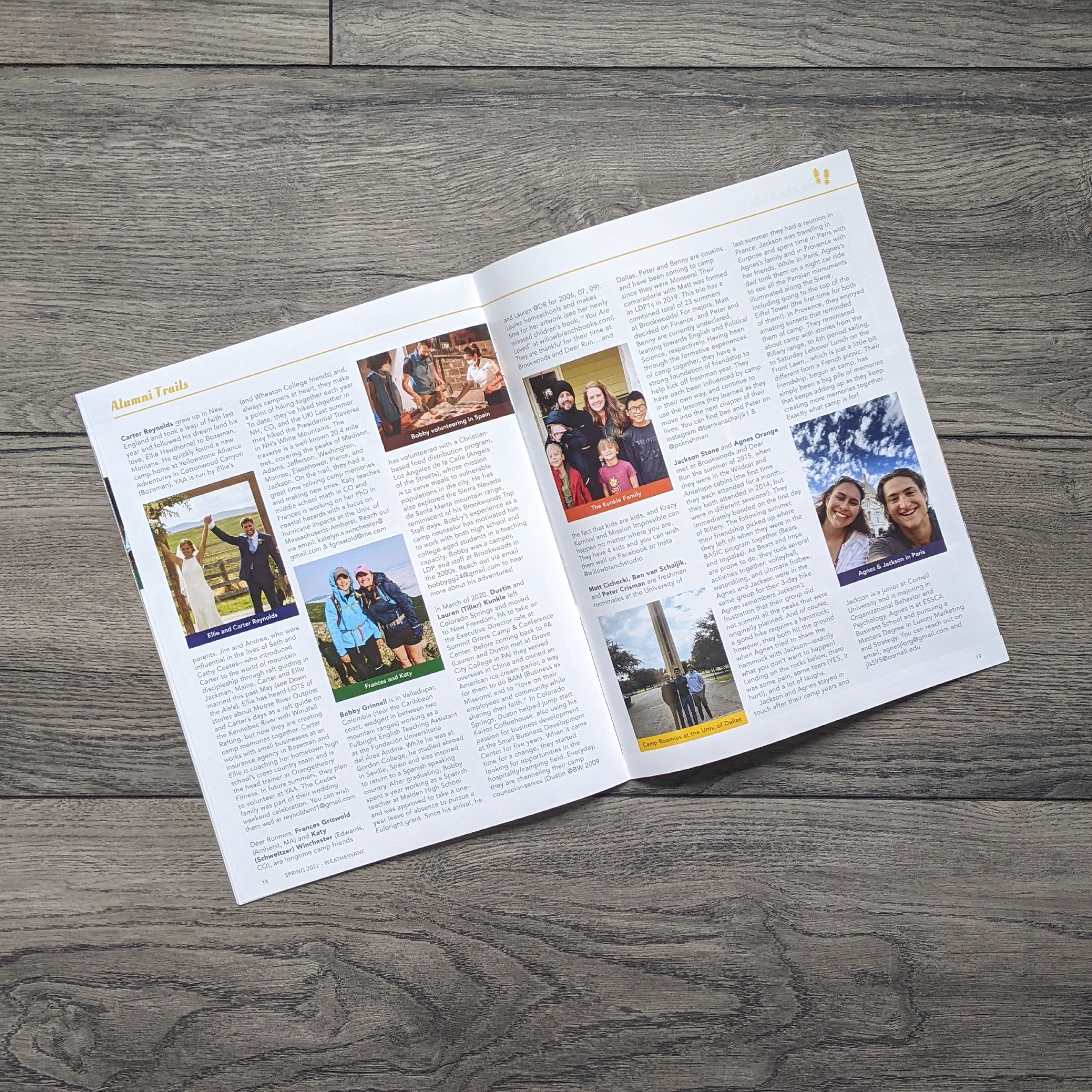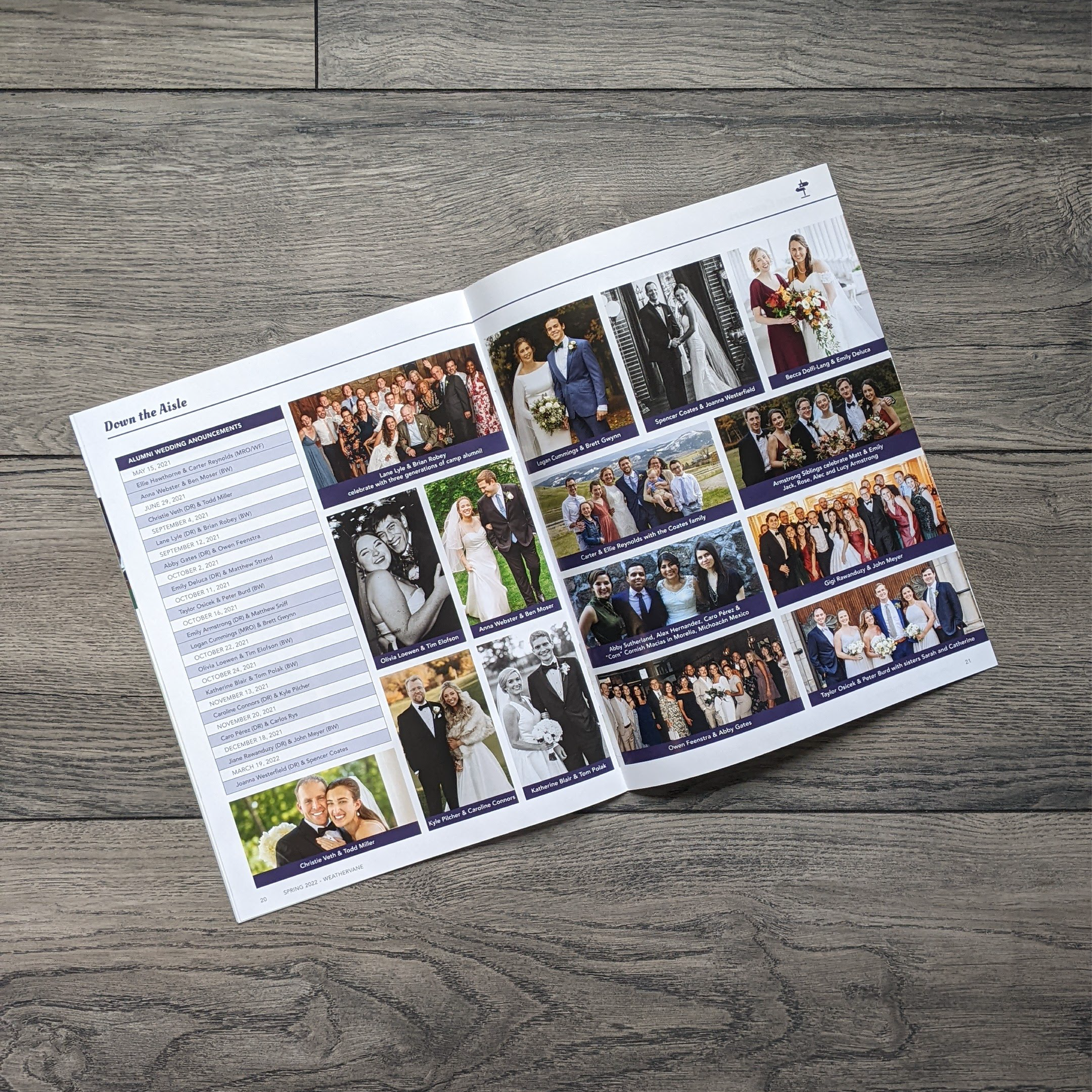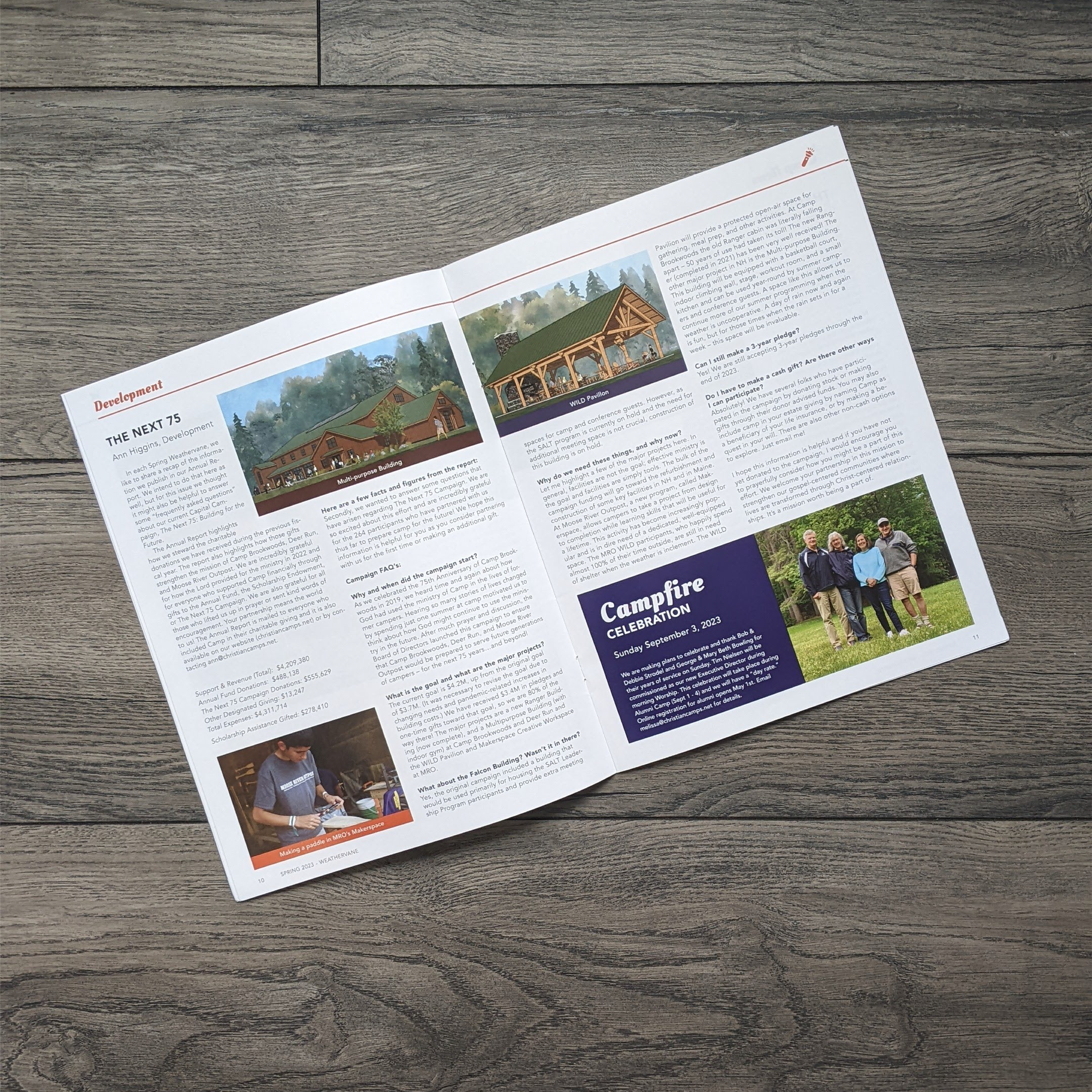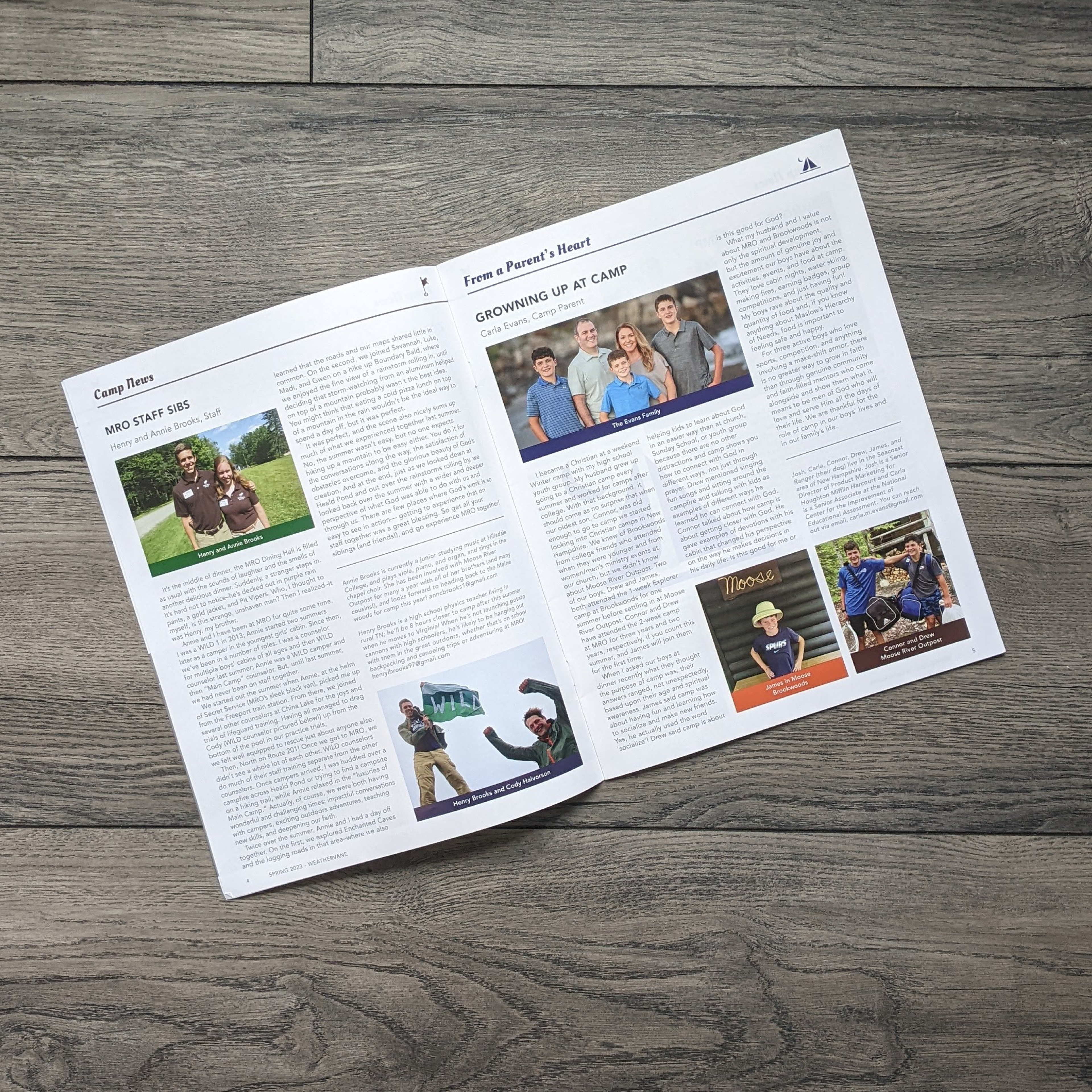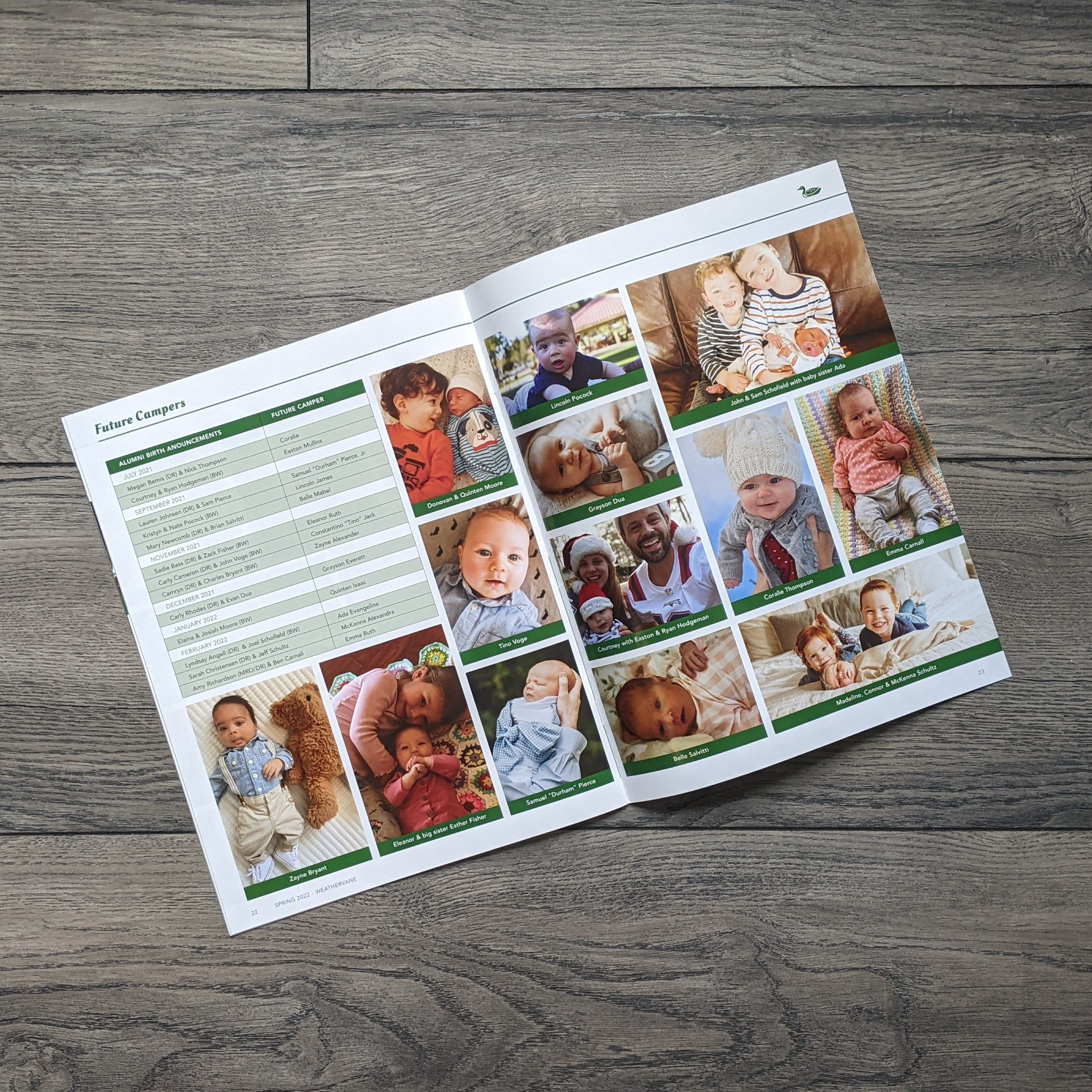


When the leadership at Camp Brookwoods + Deer Run decided they want to redesign The Weathervane, my goal is to keep the magazine familiar to alumni but bring more of the joy we all feel at camp into the design! I enlarged the logo mark, combined it with a bold humanist logo type, and created a masthead lockup to modernize and improve readability. Camp is iconic, so I created a set of illustrated icons to use throughout. What makes camp such a special place is the people, so I focused on mainly featuring the photography in interesting ways while bringing icons in as underlays to break up white space. I added more color into the layout with headers and captions on every page so the experience of reading the magazine is playful like summer camp. I remember running to the mailbox to receive the latest issue of the Weathervane. I hope I create a happy camper vibe with the layout design template and style guide complete with space for camper call-outs, emails, and monochrome tables that make finding information easy and connecting with friends seamless. Role: Design + Production Client: Camp Brookwoods + Deer Run
